Meet the Norman door. A Norman door is one where the design tells you to do the opposite of what you're supposed to do or gives the wrong signal and needs a sign to correct it. But this principle isn't limited to doors. I was reminded of Don Norman's design principles during a recent interaction with my local public services. Norman, a leading human-centered design proponent, introduced the concept of poorly designed doors in his book The Design of Everyday Things.
Once you know how to spot a Norman door, you'll start seeing them everywhere!
There are a couple of really basic principles of design, and one of them is discoverability. When I look at something, I should be able to discover what operations I can do.
In Norman's work, discoverability is an overarching concept that encompasses the six design principles for Human Centered Design (HCD)
- The first principle Norman talks about is visibility. The more visible an element is, the more likely users will know about them and how to use them.
- Norman's second principle of feedback focuses on ensuring users know what action has been taken and what has been accomplished.
- The third principle talks about constraints, which are aspects of a design that restrict users in a helpful way, limiting their interaction.
- Norman's fourth design principle is mapping; establishing clear relationship between controls and the effect they have on the world.
- The fifth consistency principle refers to having similar operations and similar elements for achieving similar tasks.
- Finally, affordances are attributes of an object that clearly suggest how it might be used.
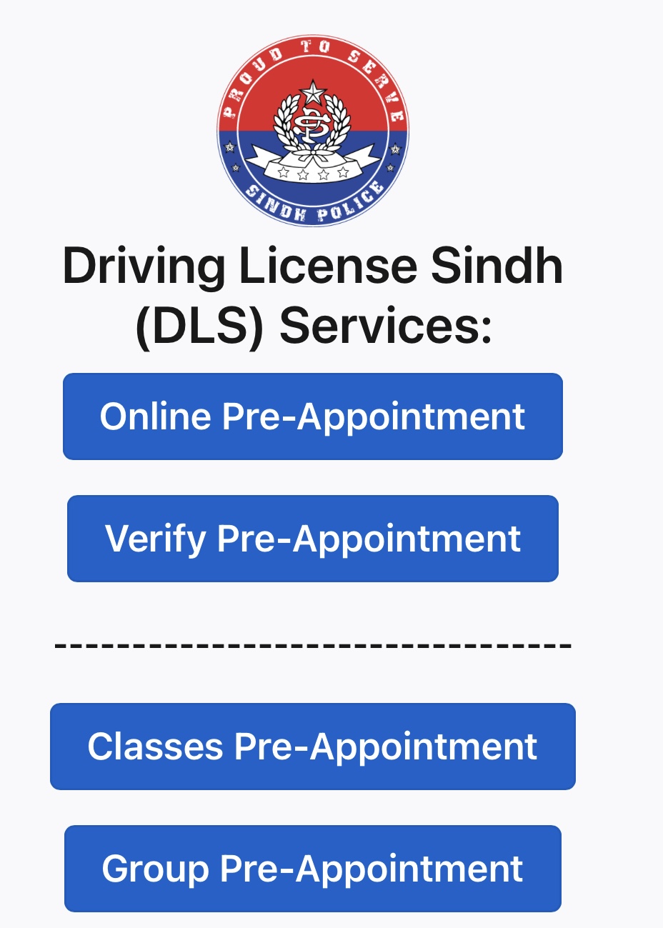
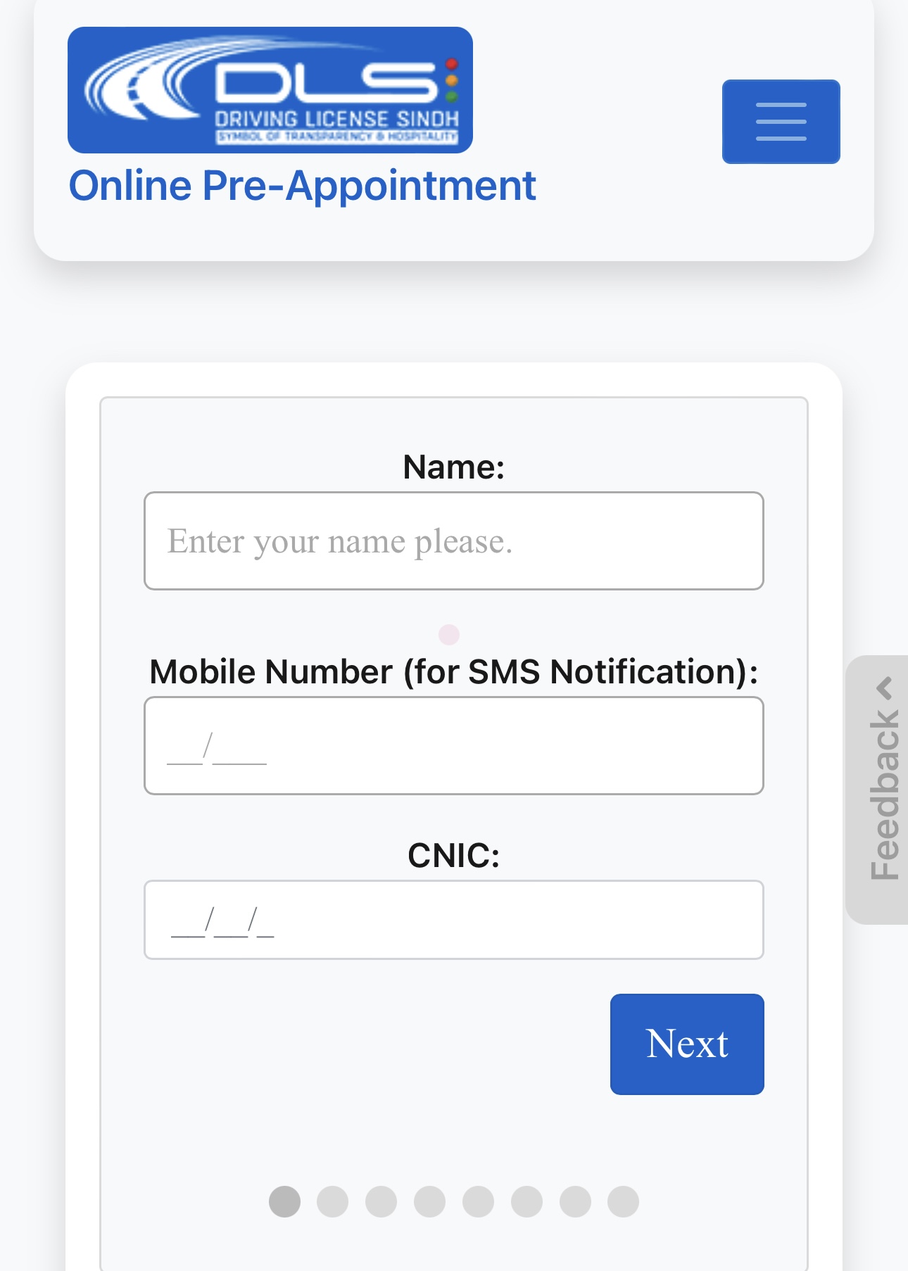
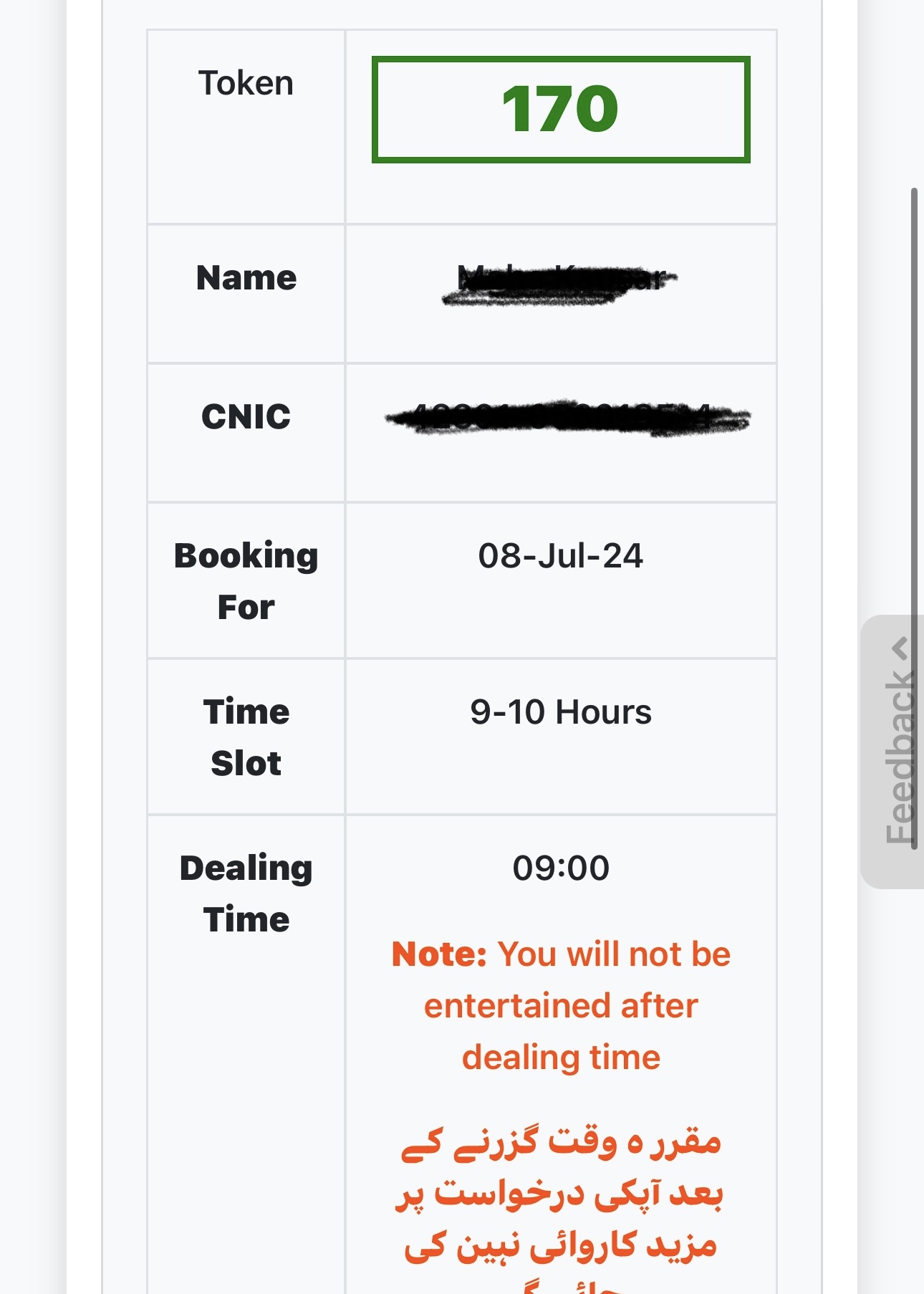
A few weeks ago, I visited the Sindh Driving License Authority website to renew my driving license. Reflecting on Don Norman's design principles, I wanted to see how well the overall process applied to my user experience. Logging on to the website, I found a detailed but easy-to-use interface to enter my information and book an appointment at my closest customer center. I was presented with options, which appeared to be straightforward but also a bit confusing; I didn't know what pre-appointment meant. The form did allow me to visualize my progress through the many fields of required data. After some struggle, I managed to get my appointment, and my token number was issued, saving me considerable time.
As I arrived on site, the first thing I noticed were the doors. Glass doors with 'push' stickers and handles (affordances). I could have sworn I heard Norman chuckle. I had a token for a specific time slot, and as I looked around for a queue trying to figure out when my number would be called, I couldnt find any sign. I thought to myself, I would have installed a clearly marked sign (visibility) for those who come through online booking.
As I moved around, I noticed ceiling-mounted display units, but there were no numbers on them. Upon inquiry, I learned the premises had recently undergone renovations, and the systems were not yet fully functional. At least they are where one would expect them to be, I thought (mapping).
A few moments later a police officer manually separated people with tokens and directed those without one to the waiting area. A clearly marked poster on the wall, with all the steps, would have been sufficient here (feedback). I quickly moved up the line as there was a separate queue for women. At the counter, the officer had all my pre-filled information from my appointment registration.
At the payment counter, change became a cause of concern, since there was no mention of fees on the website and I had not brought enough with me. Having this information beforehand (constraints) can prevent such headaches. After making the payment, I took a photo at another counter, not far from where I had registered, and the officer on duty asked me to get my eye examination done. None of these steps were labeled within the premises (consistency). Later during my research, I found videos online guiding users through the process, but again they were not visibile enough for me.
When my eye exam began, I noticed that my chair was low and the reading board was placed high up against the window. The setup here lacked mapping yet again; the distance between my chair and the eye exam board made reading difficult. The process was hurried, with a sea of people in and outside the waiting room. I received a quick stamp on my documents and, upon inquiry, was directed to another room to verify all my information.
While waiting, I chatted with a staff member to find out why the token display boards were not working in this room either. She laughed and said, "Because this is a government office". "So what?" I asked. "Why shouldn't a government office work just as well as a private one? Your system was great when I signed up online, so you've done a great job there." She looked a bit sheepish and said, "You should complain, but don't take my name," in a hushed whisper.
"Sure, I will," I continued to ask questions. "When was this renovated?"
"As recently as a few weeks ago, and there is still work to be done," she replied.
That explained the non-functional display boards. Proper feedback mechanisms are crucial for users to understand the status of their process, and visibility ensures users can easily access necessary information and next steps.
After my documents were verified, I was issued a token with all my details. I was informed that I will receive my license in the mail within 10 working days. This part of the process adhered to Norman's principle of consistency, ensuring the steps followed a logical sequence similar to my online registration.
I wanted to share my experience for two reasons. First, to commend the effort that made the website and registration process a relatively well-thought-out experience for me. Second, to highlight that more public offices in Sindh and other parts of Pakistan can enhance user experiences by adopting a human-centered design approach, similar to my experience with the Sindh Driving License Office website. Despite the on-ground issues attributed to the recent renovations, continuous user feedback is key. By engaging as citizens, the end users to provide continous feedback and encouraging good practices, we can help improve our systems from within.
Don Norman's process of discoverability is iterative; it involves observing how people perform tasks, generating clearer ideas, proposing solutions, prototyping, and testing. This approach has spread worldwide, improving lives by solving significant problems in public health, water, sanitation, farming, and more.
An ideal, human-centered door is one that operates so seamlessly that I'm not even aware of opening or closing it. It's so well-designed that it feels automatic. It's time to end the tyranny of bad doors and embrace better design for a better experience.


